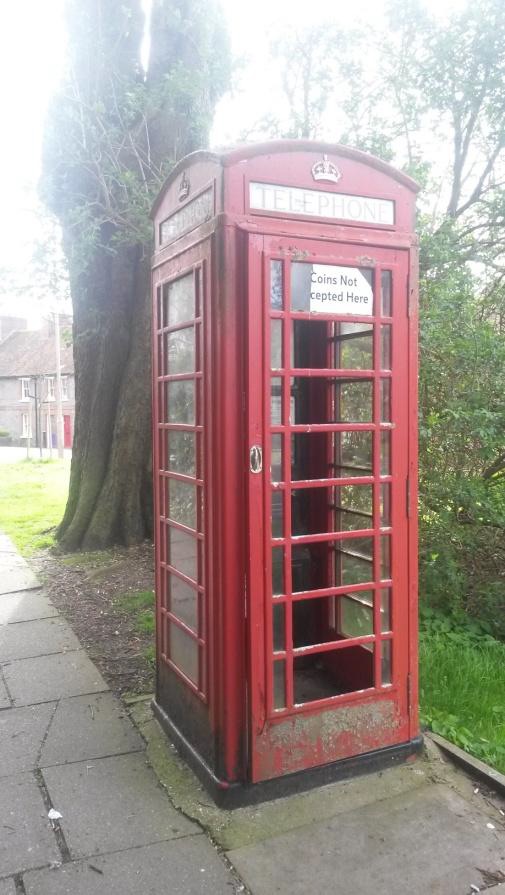
Did you know that the red telephone box on the corner of Parklands Road and Westgate is protected, and listed grade II? It was listed in July 1995 by Historic England, sixty years after it had been erected.
To look at the state of it, you wouldn’t know it would you?
The citation reads:
CHICHESTER WESTGATE (north side), Telephone Kiosk, Type K6, designed in 1935 by Sir Giles Gilbert Scott. Made by various contractors for cast iron. Square kiosk with domed roof, unperforated crowns to top panels and margin glazing to windows and door.
History of the red telephone box
It was only after the General Post Office took over the ever-expanding telephone network in 1912 that they decided phone boxes should have a uniform look and in 1921 the kiosk number one – or K1 telephone kiosk – was introduced.
In 1923, the GPO held a competition to design a new kiosk and designs from many companies and architects were entered. It was not until 1926, however, that the chosen design appeared, the Giles Gilbert Scott’s K2, but unfortunately this proved too big and very expensive for mass production.
The GPO was still keen to have a new design and once again commissioned Sir Giles to produce another design. In 1929 the K3 appeared, a smaller, concrete version of the K2, this kiosk was an immediate success with 12,000 appearing countrywide.
The K4, nicknamed the Vermillion Giant, was intended to be a 24 hour post office with a stamp machine and letter box added to the back but proved to be a dismal failure with only 50 being produced and was soon withdrawn.
In 1934, a K5 was produced, made of plywood as a temporary kiosk for use at exhibitions and fairs etc. It was only in the 1990s that the designs of this box were rediscovered and it is not known if any originals still survive.
There were many K3s still in use but problems were beginning to occur with them, and the GPO considered that a new cast iron box was needed. In 1936 the K6 appeared for the first time on the streets. The kiosk was perfect, it had all the good points of the K1s and K3s mixed with the solidity of the K2 and most importantly, the small size and elegance that the GPO were looking for. The K6 was widely used and by the end of production, there were nearly 70,000 K6s in Britain. Many areas didn’t first approve of the red paint and so were allowed to paint them in alternative colour schemes. Ironically it is now the iconic ‘red’ which has become the familiar symbol associated with our heritage kiosks.
The K7 – planned in 1959 – was designed by Neville Condor. It was an innovative design in its use of materials and six prototypes were produced in aluminum. It was eventually produced 1962; however the British climate caused discolouration and staining of the aluminum so the design didn’t prove successful and very few were introduced onto the streets of Britain.
The K8 was introduced by the British Post Office in July 1968. Two designers, Douglas Scott and Bruce Martin, had been commissioned in 1965 to produce designs for a new kiosk. The chosen design had to incorporate the best features of previous designs and be suitable for both urban and rural surroundings.
Bruce Martin’s design was eventually selected and when introduced had been produced in just over one year, the shortest time then taken to create a new kiosk. It was made from cast iron and contained full length toughened glass, and became the successor to Kiosk No. 6 (the K6).
The K6
 In 1935 the K6 (kiosk number six) was designed to commemorate the silver jubilee of King George V. It was consequently sometimes known as the “Jubilee” kiosk. It went into production in 1936. The K6 was the first red telephone kiosk to be extensively used outside London, and many thousands were deployed in virtually every town and city, replacing most of the existing kiosks and establishing thousands of new sites. In 1935 there had been 19,000 public telephones in the UK: by 1940, thanks to the K6, there were 35,000 and by the time of the introduction of the more modern K8 in the 1960s this number reached 64,000.
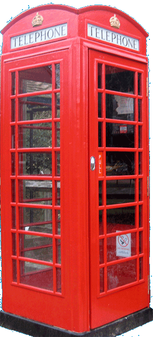
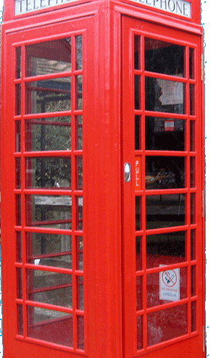
Ours is currently in a pretty sorry state. This is what it should look like! Shouldn’t we be doing something about this?
The design was again by Scott, and was essentially a smaller and more streamlined version of the K2, intended to be produced at a considerably cheaper cost, and to occupy less pavement space. The principal differences between the two designs were –
Size: The K6 was 8 feet 3 inches (2.51 m) tall and weighed 13.5 cwt (0.69 tonnes). This compared with 9 feet 3 inches (2.82 m) and 1.25 tons (1.27 tonnes) for the K2.
Elements of the design were simplified and streamlined, in keeping with the “moderne” aesthetics of the 1930s. The Grecian fluting was removed from the door and window surrounds, and the previously separate pediment and frieze were merged.
The Crown motif: which had previously been pierced through the ironwork to give ventilation, was now embossed in bas-relief. A new, separate ventilation slot was provided.
A new glazing pattern: the door and two glazed sides of the K2 each had 18 equal-sized panes of glass arranged in 6 rows of 3. In the K6 the number of rows was increased to 8, and the central column of panes was made considerably wider than those to either side. This improved visibility, and gave a more horizontal appearance to the windows, again in keeping with “moderne” principles.
The K6 has since become a British icon, but it was not universally loved at the start. The red colour caused particular local difficulties and there were many requests for less visible colours. The Post Office was forced into allowing a less strident grey with red glazing bars scheme for areas of natural and architectural beauty. Ironically, some of these areas that have preserved their telephone boxes have now painted them red.
Sources:
Wikipedia: https://en.wikipedia.org/wiki/Red_telephone_box
http://heritage.hampsteadnorreys.org.uk/Phone-Box.html
Paula Chatfield: Parklands Residents’ Association Easter Trail
